 07 5479 3888
Web Design Mistakes to Avoid That Kill Conversions

Suncoast Web Solutions
 26th May, 2025
 -

Avoid costly UX design fails and learn CRO strategies to fix common website UX issues fast.
Table of Contents
- Introduction to Mistakes
- Why These Mistakes Happen
- Confusing Website Navigation
- Slow Speed Hurts UX & SEO
- Mobile Usability Mistakes
- Weak Calls to Action (CTAs)
- Poor Page Layout & Readability
- Visual Clutter Problems
- Building Visitor Trust
- Ignoring Analytics & CRO
- Conversion-Focused Website
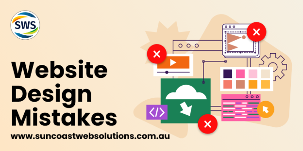
Web Design Mistakes to Avoid From the Start
Web design mistakes to avoid can cost you leads, sales, and trust before you even realize it. You can have the most beautiful website in the world. But if it’s confusing to use or hard to navigate, it won’t convert visitors into customers.
A strong online presence is about more than style. It’s about performance, ease of use, and user experience. Too many websites look polished but fall short where it counts, helping visitors take action. Others try to impress with flashy features but lose focus on what the visitor actually needs. Poor design choices don’t just frustrate users; they cost you money.
This guide is here to help you understand what’s holding your website back. These aren’t minor tweaks. They’re major issues that can quietly stall your business growth. Whether you’re managing a service-based business, launching an eCommerce site, or refreshing an outdated design, these lessons apply.
We’ll cover everything from broken navigation and mobile issues to poor page layout and trust gaps. You’ll also learn practical fixes and how to spot trouble areas fast. By the end, you’ll be equipped to create a site that not only looks good but delivers results. Along the way, we’ll highlight key conversion rate optimization principles and ensure your site avoids common website UX issues.
And if you’re weighing the costs of design, check out our post on why cheap design could cost you more.
Why These Mistakes Happen
Most web design mistakes aren’t intentional. They happen when business owners try to do everything themselves or when developers focus more on aesthetics than strategy. Sometimes, it’s a case of outdated knowledge or rushing to launch before testing. Understanding the “why” helps you be more mindful when building or updating your site.
When you’re short on time, it’s easy to prioritize design over usability. But the truth is, both matter. Even the best-looking site won’t convert if users can’t navigate it, find what they need, or feel secure making a purchase.
Confusing Website Navigation: A Web Design Mistake to Avoid and UX Design Fail

If visitors can’t figure out how to get around your site, they won’t stick around. Confusing menus and cluttered links are classic signs of poor planning. Navigation needs to guide people, not overwhelm them.
Signs Your Navigation Needs Help:
- Too many top-level options
- Menus that change from page to page
- Unclear button labels or jargon
- Submenus that are hard to use on mobile
- Hidden links or redundant pages
Fix It:
- Stick to 5–7 main navigation items
- Use plain, intuitive language
- Organize pages into logical groups
- Include breadcrumbs for larger sites
- Highlight key links in your footer as well
Navigation is like a map. It should make every journey easy and direct. If visitors get lost, they leave. This is one of the most overlooked common website UX issues, but it has a huge impact on engagement.
Slow Website Speed: A Common Website UX Issue That Hurts SEO and Conversions
Speed isn’t just about user experience, it’s a ranking factor. A slow-loading site turns visitors away and signals to search engines that your content might not be valuable.
What Slows Sites Down:
- Images with huge file sizes
- Scripts that load too early
- Plugins or themes that aren’t optimized
- Unused CSS and JavaScript
- Bloated page builders
How to Speed It Up:
- Compress and resize images before uploading
- Defer loading of non-essential scripts
- Choose lightweight themes
- Audit and remove unnecessary plugins
- Use a content delivery network (CDN)
Even a 1-second delay can lower conversions. Faster pages mean more engaged users and a better shot at turning visits into sales. Following basic conversion rate optimization advice, such as site speed improvements, often leads to immediate performance gains.
Mobile Usability Mistakes: Web Design Mistakes to Avoid for Mobile UX
More than half of your visitors come from a mobile device. A clunky or broken mobile experience creates frustration and damages your brand.
UX Design Fails on Mobile:
- Buttons too close together
- Menus that are difficult to tap
- Pages that don’t fit the screen
- Pop-ups that cover key content
- Slow load times on mobile networks
How to Fix Mobile Issues:
- Use responsive design with fluid grids
- Test on multiple devices (not just emulators)
- Increase tap target size and spacing
- Avoid full-screen pop-ups
- Use lightweight mobile-optimized assets
Designing mobile-first helps you build a better experience for everyone. It’s not a trend—it’s a must. Prioritize mobile usability and avoid these UX design fails to keep your users happy.
Weak Calls to Action: Web Design Mistakes to Avoid for Better CRO
If your site doesn’t tell people what to do, they won’t do anything. Strong calls to action (CTAs) are like signposts for your visitors.
Common CTA Mistakes:
- Buttons buried at the bottom
- Generic phrases like “Click Here”
- Inconsistent placement across pages
- CTAs that don’t explain the benefit
- Using the same CTA for every audience
How to Improve Your CTAs:
- Make buttons bold and noticeable
- Use language that reflects value (e.g., “Get My Free Audit”)
- Tailor CTAs to the page goal (e.g., sign up, learn more, buy now)
- Use A/B testing to compare versions
- Repeat CTAs in strategic spots (top, middle, end)
Great CTAs move people to take the next step. Make it easy, appealing, and clear. This is one of the simplest conversion rate optimization techniques and also one of the most effective.
Poor Page Layout: UX Design Fails and Web Design Mistakes to Avoid
Your layout controls how people read and interact with your site. A poor layout means even good content goes unnoticed.
Signs of Bad Readability:
- Tiny fonts or low contrast
- No headings or subheadings
- Inconsistent margins and padding
- Dense blocks of text
- Overuse of images or icons
What to Do Instead:
- Use a clear content hierarchy
- Break text into short paragraphs
- Balance visuals and white space
- Align content consistently
- Keep typography clean and legible
Think of layout as your first impression. A good one earns trust instantly. Prioritizing readability is a simple way to address common website UX issues without needing a total redesign.
Visual Clutter: A Web Design Mistake That Creates UX and CRO Problems
Too many elements fight for attention. Visitors won’t know what to focus on—and they’ll leave.
What Causes Clutter:
- Overloaded homepages
- Background videos that autoplay
- Multiple fonts and colors
- Icons with no purpose
- Disorganized sidebars
How to Simplify:
- Use fewer elements per section
- Pick two primary colors and stick to them
- Keep font choices consistent
- Ask if every item on the page adds value
- Limit distractions like auto sliders or pop-ups
Clean design isn’t boring, it’s confident. Less clutter means more conversions. Reducing clutter is a foundational conversion rate optimization tactic that brings clarity and focus to every page.
Not Building Trust: One of the Most Costly Web Design Mistakes to Avoid
Without trust, even the best offer falls flat. Your site should feel honest, secure, and human.
Trust-Killing Mistakes:
- No photos or real names on testimonials
- Missing privacy policies
- Vague business details
- Generic stock photos
- Outdated design that feels abandoned
Easy Ways to Build Trust:
- Add a team section with photos and bios
- Show reviews from real customers
- Use HTTPS and display security seals
- Share your origin story
- Include transparent policies and guarantees
Trust takes time to build, but only seconds to lose. Start earning it right away.
Ignoring Analytics: A Web Design Mistake to Avoid for Smarter CRO

You can’t improve what you don’t measure. Data helps you validate decisions and uncover hidden problems.
Signs You’re Not Using Data:
- You don’t track conversions
- You never test changes
- You guess at what content works
- You’re unsure where users drop off
How to Use Analytics:
- Install Google Analytics and define clear goals
- Use tools like Hotjar or Clarity for visual insights
- Set up event tracking (like button clicks)
- Monitor high-exit pages and session duration
- Use data to guide content, layout, and navigation
Let the numbers shape your design, not opinions. This is one of the most essential steps in
conversion rate optimization and should never be overlooked.
For more marketing help, explore local business marketing strategies.
Let’s Turn Your Website into a Conversion Machine
Your website should be your hardest-working tool, not a hidden obstacle. If any of these issues sound familiar, you’re not alone. But you don’t have to fix everything on your own.
At Suncoast Web Solutions, we help businesses like yours build websites that are smart, fast, and built to convert. Whether you’re starting fresh or need to refine what you have, we’re here to help.
We combine design with strategy, usability with personality. You get a site that reflects your business and works toward your goals, not just one that looks good.
What if the only thing standing between your vision and results is one conversation?
Let’s find out.
Book a Free Strategy Call today. No pressure, just possibilities.
we are your one-stop internet marketing solution on the sunshine coast!
Get In Touch With Us!
Let's Talk


Related Posts


